Are you considering SharePoint as an Intranet solution? Maybe you’ve already made the move and you’re looking to spruce up the home page to continue engaging your employees. As Microsoft continues to release new features, it can be time-consuming to get caught up.
I’ve put together a list of my favorite new and upcoming features for modern SharePoint sites. The list consists of Intranet-focused enhancements that you may have been waiting for or should learn more about. I know I’ve been eagerly waiting for some of these, maybe you have too.
My List
The list is a mix of in development, rolling out and recently released features. I’ve broken my list down into three major categories.
News & Events
Design
New Web Parts
News & Events
SharePoint organizational news: audience targeting
Current Hub News Layout

Overview
You can better define what news articles and pages appear on the home experience of your site by configuring what is visible to specific groups. Each person will have a unique experience that complies with what you wish them to view without creating multiple audience-specific sites, you can serve them all from within a more centralized location with a personalized, targeted experience. Audience targeting support will be enabled in news, pages and other web parts so that you can define and target who best to reach with content and site experiences.
Why I Like It
I can think of many instances within an organization that this would be useful. Content can now easily be tailored for your leadership team, sales force and site specific outages or emergencies. This is just another step in the right direction to providing a customized experience with minimal effort.
Specifics
- Featured ID: 30695
- September CY2018
- In Development
SharePoint organizational news: hub site news web part update
Overview
The unique ‘hub layout’ in the news web part for SharePoint hub sites will provide additional capabilities like pinning news articles, a new compact layout, and carousel support. Choose from a new variety of news layouts to best promote your news on your pages.
Why I Like It
Content is able to flow better and adapt when a design becomes more flexible and modular. Removing the rigidity of the Hub News web part, alone is a great improvement, but allowing users to pin news articles provides a more modern and customized user experience.
Specifics
- Featured ID: 30691
- Q3 CY2018
- In Development
SharePoint organizational news: deem specific sites as main news sites
Overview
As news rolls up to people across their SharePoint home in Office 365, or via the news tab in their SharePoint mobile all, the news that comes from “organizational news source” sites will get special visual treatment bubbling up to the top of one’s view.
Why I Like It
Microsoft has made vast improvements on how people discover content. The SharePoint home page is a great place to access the latest activity around the sites. The news tab on SharePoint mobile enables users to have access to the latest posts from anywhere.
But with all of this content, how do users deem what’s important? This new feature helps cut through the noise and presents users with a less cluttered experience that aids them in accessing the most important content first.
Specifics
- Featured ID: 30694
- Q3 CY2018
- In Development
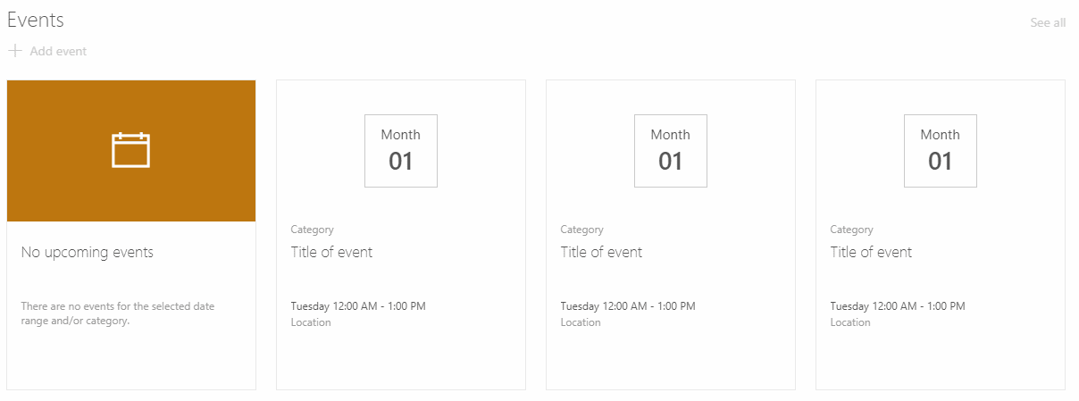
SharePoint hub sites: Events web part roll up
Overview
Similar to the News web part and Site activity, commonly used on the home page of a hub site, you can now leverage the Events web part to roll events up from associated sites so that the aggregated view appears at the hub site level.
Why I Like It
This features solves the age-old problem of unused department calendars! As a SharePoint consultant, I’ve seen too many neglected calendars on department pages for a lifetime. By rolling-up events, departments can easily share major events with the rest of their organization. When events roll-up, there is more visibility and that helps drive meaningful content creation.
Specifics
- Featured ID: 33135
- Q1 CY2019
- In Development
SharePoint pages and news: custom metadata columns
Overview
Allow customers to add custom metadata to modern SharePoint pages and news articles. This gives you the ability to create prescriptive information architecture and solutions that use the pages/news’ metadata for dynamic grouping and organization. It, too, ships with a new Page properties web part used to display select metadata on the page itself.
Why I Like It
I’ve come up with my own workarounds to this issue in the past. The addition of metadata for pages and news is a great upcoming feature that will give the Highlighted Content web part a much needed break. Being able to provide metadata alone is a helpful tool, but the ability to group content as well can assist users in finding information much faster.
Specifics
- Featured ID: 27251
- Q3 CY2018
- Rolling Out
Design
SharePoint hub sites: add rich color to header
What it looks like now

What it could look like

Overview
You will now have choices beyond the color white. It’ll be easier and more flexible to adhere to your preferred company theme and brand colors across more aspects of the sites and pages.
Why I Like It
As a designer myself, I always enjoy more customization options in the new modern SharePoint. I prefer to keep things simple and leverage white-space wherever I can. However for some of my clients, incorporating more color may be the difference between SharePoint as a company Intranet or a third-party tool.
Specifics
- Featured ID: 30697
- September CY2018
- In Development
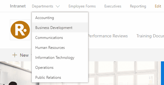
SharePoint hub sites: mega menu navigation
What it looks like now
Overview
Increase the value of your hub site navigation. The new mega menu options allows for multiple levels of hierarchy at once – no fly-outs needed. This will enable you to better organize and showcase the content and sites associated under that particular hub site.
Why I Like It
Now this one should be obvious! Many organizations have complex architectures to their departments and previous navigation structures. With the introduction of mega menu, SharePoint can become a much better navigation tool.
Previously, anyone developing a hub site was forced into single categorized buckets of links for navigation. This not only can cause frustration when thinking about migrating, it may also result in lengthy, broken-out categories that overwhelm users.
Specifics
- Featured ID: 33132
- Q1 CY2019
- In Development
SharePoint sites: new site header layouts
What it looks like now

Overview
Now, site owners can reclaim some of the vertical space at the top of the site and highlight the main page content instead. There will be three new choices: standard, minimal and compact.
Why I Like It
While I still appreciate the simplicity of the current site header, options would be great. I’m honestly not sure that I will leverage minimal very often but compact does sound appealing in some cases. Nonetheless, I do feel that the header can be a bit bulky and I would love to get back some of that precious real-estate.
Specifics Save
- Featured ID: 33131
- October CY2018
- In Development
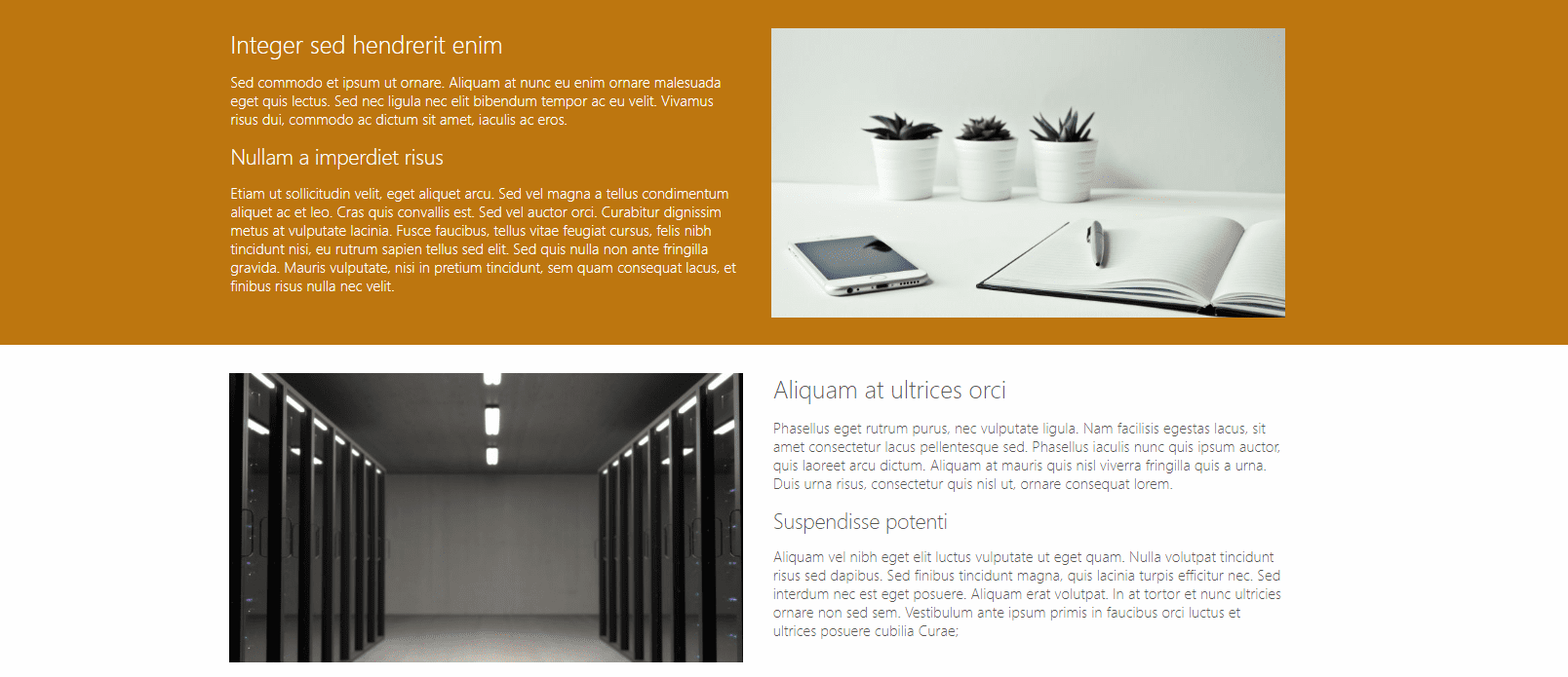
SharePoint pages: section background color
What it might look like
Overview
Create additional visual design and clarity as a user scrolls through your content. Now you can add different colors to the background of your page sections, or leave them white as they are by default.
Why I Like It
This is another feature that I’ve eagerly been wait for and am excited to share with my clients. Being able to provide section background colors, brings SharePoint back up to par with its “modern” claims. Companies can now visually engage users with accents and break up the currently mundane white pages.
Overview
- Featured ID: 33137
- Q1 CY2019
- In Development
SharePoint sites: adjust the footer of a site
Overview
When you change the look of your site, you can now add a site footer to showcase common information you wish to highlight at the bottom of your site.
Why I Like It
Who doesn’t like a footer in SharePoint? Everyone always needs to know how to “Contact IT” right? This is a common request among my clients when considering SharePoint as an Intranet. It’s another reason why I’m still using Publishing sites! Great to hear this is on the way.
Specifics
- Featured ID: 33138
- Q1 CY2019
- In Development
New Web Parts
SharePoint – Web part: PowerApps
Overview
Add any PowerApp to any SharePoint modern page, regardless of data source
Why I Like It
This finally alleviates the pains of being restricted to MS Forms. I fail to find uses for capturing simplistic data such as surveys and tests. Being able to integrate custom PowerApps onto any page really adds value for my clients. You could now provide a brief SOP on a new process at the top of the page and have a data entry-form right at the bottom.
Specifics
- Featured ID: 16117
- Q2 CY2018
- Rolling Out
SharePoint web part: Twitter
Overview
Site members will now be able to showcase Twitter feeds and individual tweets right inside SharePoint pages and news. It simple to add the Twitter web part within the layout, and then plug in the desired Twitter feed, search criteria or individual tweets.
Why I Like It
Here is just another great way to add interactive, modern content to your Intranet or team pages. I would imagine sometime down the road there will be more features added to this web part, but for now I’m just happy to get rid of Twitter embed links!
Specifics
- Featured ID: 21051
- Q1 CY2018
- Recently Released
SharePoint web part: Image (update)
What it looks like

Overview
Enhance your images with hyperlinks and allow authors to overlay text on images.
Why I Like It
The ability to create custom graphics to link to content is a useful addition to Intranet pages. Pairing that with overlaying text is a content manager’s dream! Now we’re able to upload stock photos, apply text and link to users to related content.
Overview
- Featured ID: 30684
- Q2 CY2018
- Recently Released
SharePoint web part: Weather
What it looks like in a three-column layout

Overview
Site owners and members will now be able to show the current weather on their site home page, within sub pages and/or within a news article on team sites, communication sites and hub sites. Simply add the web part to your page or news, add a location and select from Fahrenheit or Celsius (°F or °C). The web part pulls up-to-date information from MSN Weather.
Why I Like It
At first this glance this feature is more of an “ehh…” improvement. But when you have a requirement to include weather for various company locations, you’ll be thanking Microsoft. I was hard-pressed to find a decent, dynamic, customizable weather widget for free. Everything out there currently, looks like it’s left over from the early 2000’s or worse!
Specifics
- Featured ID: 27740
- Q2 CY2018
- Recently Released
Why SharePoint
Strong Intranet Solution
If you are looking for a new Intranet solution I strongly urge you to consider SharePoint. As you can see from my list, there are a lot of new and exciting features coming out all the time. With the introduction of Communications sites, SharePoint has positioned itself as a front-runner in the Intranet solutions space. Not only do you get a platform that is tried and true, but it has become increasingly more customizable to meet your needs.
Streamlined Content Management
One of the major problems with Intranets that SharePoint solves is content management. Over the years there have been many platforms in which to build a company Intranet, but previously those solutions have been clunky and difficult for even moderately experienced site administrators (SharePoint included). Now with the Communications sites and its drag-and-drop interface, content can easily be presented in a clean and modern way.


Leave A Comment