
Challenge:
Create a “simple” Responsive Canvas PowerApp that binds to a SharePoint List as a datasource, uses the simple SubmitForm functionality, and uses Data Card columns
Research:
- Microsoft’s Documentation: https://docs.microsoft.com/en-us/powerapps/maker/canvas-apps/create-responsive-layout – Good documentation on some basic knowledge you need. But, missing a lot of details on real life situations.
- PowerApps Blog: https://powerapps.microsoft.com/en-us/blog/new-properties-for-responsive-canvas-apps/ – another good reference blog. But, once again, not a real life situation.
- Fidelity Factory Blog: https://www.fidelityfactory.com/blog/2019/9/27/building-reponsive-powerapps-canvas-apps – this is a real life situation. But, they aren’t using the DataCards the way I want. This works better if you aren’t trying to take advantage of all the binding you get with DataCards and SharePoint.
Conclusion:
Lots of good reference material out there. But, I couldn’t find a single place with a real life situation doing this with the DataCards that are created when you bind to a SharePoint list (or any other data source for that matter) [statement as of 5/12/2020]
Walkthough:
Initial Setup
-
-
-
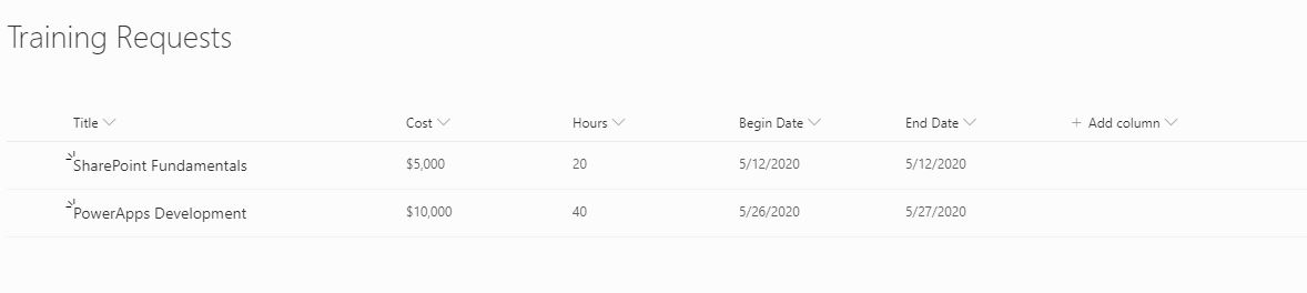
- Create a SharePoint List. For this example, we are going to do a simple Training Request Form.
- Go to PowerApps -> Create a New Canvas App -> Pick Blank App/Tablet Layout (even though the Tablet Layout won’t matter much after we change a few things)
- Go back to the Settings of the App you just Created (File -> Settings)
- Click on the Screen size + orientation -> “uncheck” Scale to fit, Lock aspect ratio, Lock orientation
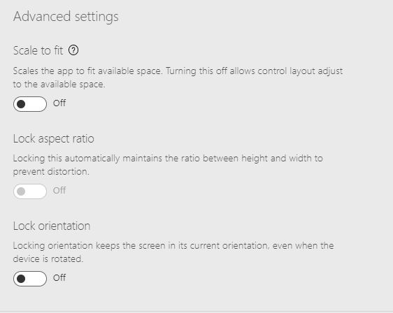
Note: Leave the Orientation in Landscape and the Size as 16:9 (these won’t matter much later, but it’s nice to have your dev/preview environment set to these)
Important: Make sure you click Apply at the bottom of this page. It is something I miss a lot. Very easy to overlook.
- Optional: Click on Advanced settings. Turn on Container Control (this is optional because I like using this feature and will use it in the walkthrough. But, it is not needed for every PowerApp you build. I just like it)
- Go back to start building your App
- Add a Connection for the SharePoint list you created earlier (if you don’t know how to add connections on PowerApps, refer here: https://docs.microsoft.com/en-us/powerapps/maker/canvas-apps/add-data-connection)
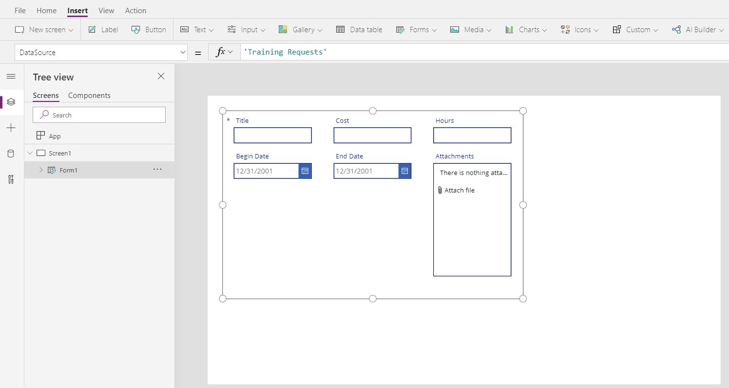
- Add an Edit Form to your Screen
- Set the DataSource to the Connection you created earlier
- At this point, your PowerApp should look something like this
Note: some people have experienced PowerApps not adding the fields automatically. Not sure why it does it in some environments and not others. If your fields are not added to the form automatically, simply manually add the fields in the picture below
- Create a SharePoint List. For this example, we are going to do a simple Training Request Form.
-
-
Let’s Make it responsive!
Before we begin, let’s go over a few concepts:
- App.Width / App.Height – these refer to the width and height of the application respectively. You can correlate these to browser width and height.
- App.DesignWidth / App.DesignHeight – these refer to the Screen size you set on the Advanced Settings -> Screen size + orientation setup. These are problematic for responsive design and we will be replacing them throughout the walkthrough.
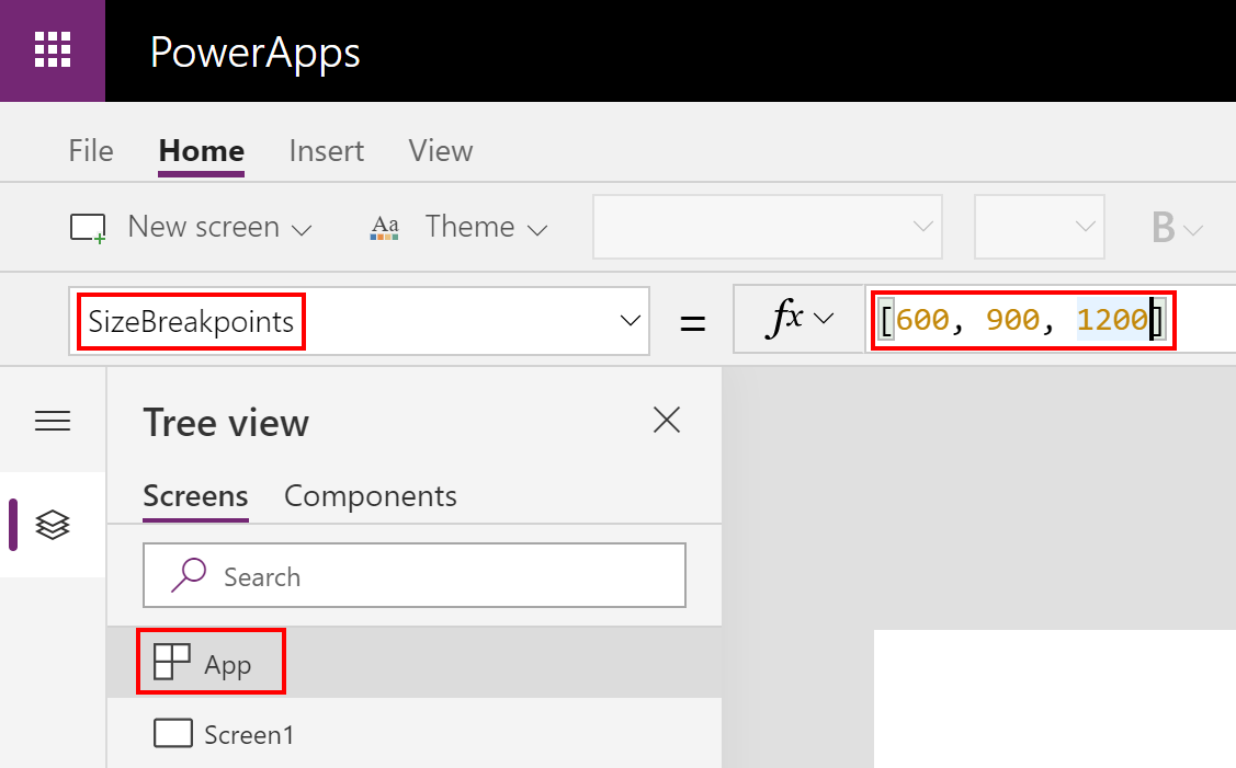
- ScreenSize – this refers to the SizeBreakpoints. Size BreakPoints are set at the App level.
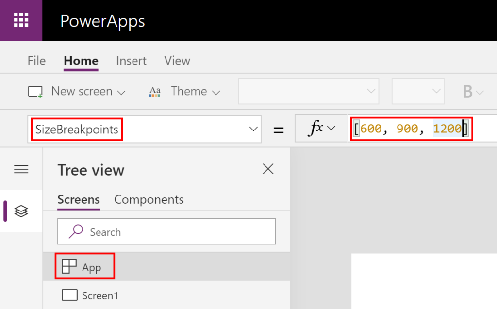
Quick Tip: You can change the breakpoints by updating the SizeBreakpoints array (if you don’t like the default ones Microsoft picked)
You refer to these breakpoints by using the ScreenSize property:
- ScreenSize.Small = 1
- ScreenSize.Medium = 2
- ScreenSize.Large = 3
- ScreenSize.ExtraLarge = 4
Lastly, you compare the ScreenSize to the Screen1.Size. So, if I want to see if we are in mobile, I will do: If(Screen1.Size > ScreenSize.Small, “medium, large, extralarge”, “small”)
Ok, now for the walkthrough…
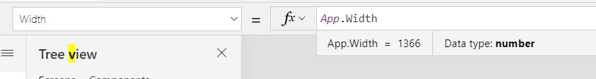
- First we need to set our Screens Width. By Default, PowerApps set’s it to…
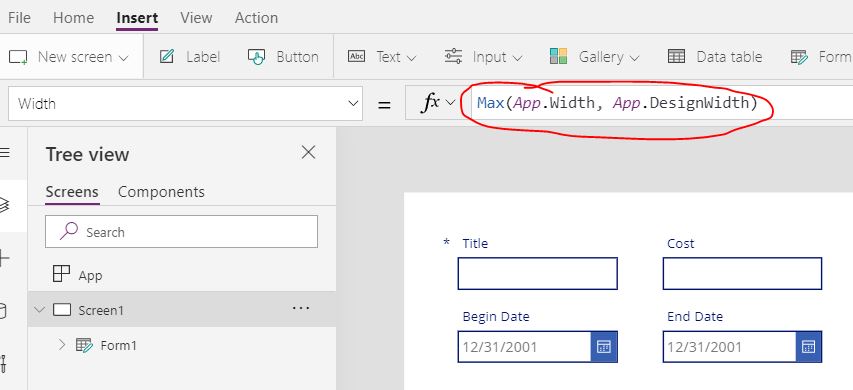 Let’s evaluate what this is saying. It is saying use either the App.Width or the App.Design. Whatever is larger. App.Width is the width of your browser. However, App.Design is whatever you setup in the Advance Settings -> Screen size + orientation. We left that landscape. So, technically this is 1366 right now. That’s way too big for responsive/mobile. So, what we want to do is set this to the actual Apps width.
- Next we need to set the Screens Height. Very similar to the Screens Width. We just want to control how small the screen can get to from a height perspective:
- Height = App.Height
- Next, let’s create some variables in the App OnStart
- varRequestID – this is a technique I like using to denote between Edit forms and New forms when building apps like this. We are basically using a query string to pass up the id.
- varPrimaryColor – this is a technique I like using to make map apps colors consistent throughout. I am setting ours up to RGBA(20, 22, 84, 1) for this demo
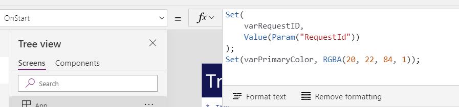
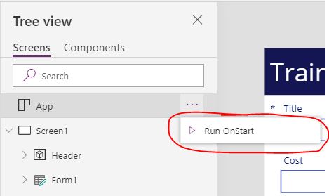
Note: it is a good idea to run App > Run OnStart() at this point to ensure all your variables are set
- One last thing to setup our form before we start doing the responsive design. We need to setup the New/Edit functionality.
- Set the following properties of your Form (i.e.: should be called Form1 at this point since we didn’t rename it)
- Default mode = If(varRequestID > 0, FormMode.Edit, FormMode.New)

- Item = If(varRequestID > 0, LookUp(‘Training Requests’, ID = varRequestID), Defaults(‘Training Requests’))
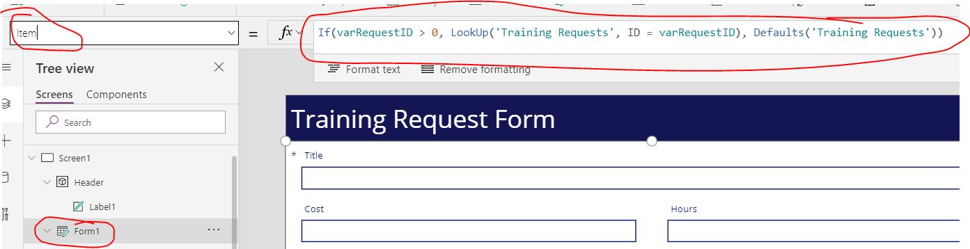
Note: We are doing this so we can have a single form that does new and/or edit based on the ID passed up in the query string that we collected on App Start
- Default mode = If(varRequestID > 0, FormMode.Edit, FormMode.New)
- Set the following properties of your Form (i.e.: should be called Form1 at this point since we didn’t rename it)
- Now let’s build a header on our app. This is technically optional. But, we like making PowerApps look good.
- Add a Container to your Screen (note: if you don’t see Container under the Insert -> Input options, that means you didn’t activate that feature in the File -> Settings -> Advanced Settings).
- Rename the Container Header
- Set the Following Properties of the Header:
- Width = Parent.Width
- Y = 0
- X = 0
- Height = 86
- Fill = varPrimaryColor
- Add a Label to the Header
- Text = “Training Request Form”
- Height = Parent.Height
- Width = Parent.Width
- X = 0
- Y = 0
- PaddingLeft = 20
- Color = any color you want. I am using White for this demo RBGA(255, 255, 255, 1)
- Size = 35
- Make the Label Responsive – the issue here is the Font. I want it to get smaller as the app goes past our breakpoint. So, change the following:
- Size = If(Screen1.Size > ScreenSize.Small, 35, 25)
Note: this technique is very useful as you put more things in your header. In production, we might add an image, status information, etc. So, we can use the ScreenSize.Small to change sizes, visibility, etc. of header items
- Now let’s make our form Responsive
-
-
- Ensure Snap to columns is off and set the columns to 1
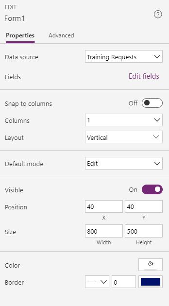
- Set the following properties on the form:
- X = Parent.Width/2 – Form1.Width/2
- Y = Parent.Height/2 – Form1.Height/2 + Header.Height/2
- Height = App.Height – Header.Height
- Width = Parent.Width
- Set the following property on EVERY DataCard in the form
- Width =Form1.Width
This is very important for mobile first design. We need the default to be 100% width
- Width =Form1.Width
- Ensure Snap to columns is off and set the columns to 1
-
-

Technically our form is responsive right now! But, I am not a big fan of 100% columns on large screens. So, the next steps show how to make this form multi-column for large screen and single column for smaller.
Multi-Column
- Set the following property on EVERY DataCard in the form
- Width =If(Screen1.Size > ScreenSize.Small, Form1.Width / 2, Form1.Width)
This is basically saying that when we hit our breakpoint, set the width to half the size of the form
- Width =If(Screen1.Size > ScreenSize.Small, Form1.Width / 2, Form1.Width)
- Set the follow on EVERY DataCard in the form
- X = 0
- Y = 0
The reason to set the X and Y to 0 for the DataCards is because PowerApps will respect the order of the DataCards when the X and Y are 0. Thus, laying them out fluidly based on their widths.
- Lastly, to lay this particular screen out correctly, I want the Title and Attachments DataCards to be 100% width. So, change the Width on the Title and Attachments DataCards to:
- Width =Form1.Width
Ready to Test
Unfortunately, the Preview of PowerApps isn’t great at showing responsive design [statement as of 5/12/2020]. So, to test this, we have to publish our changes and bring up the App URL. Unfortunately, it sometimes takes a few refreshes of the App when you make changes, publish and try to test with the URL. It takes a lot of patience to test responsiveness in PowerApps.
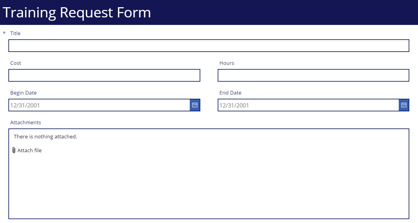
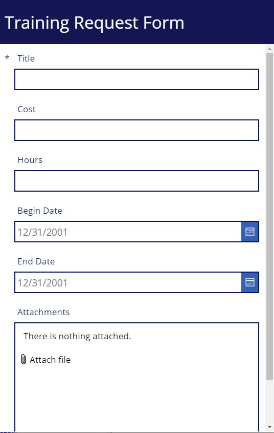
|
Desktop View
|
Mobile View
|
Gregory! Thanks so much for this post. Specifically, your warning about the need to click the “Apply” button on the File > Settings > Screen size + orientation screen after changing settings needed for this responsive design. I was pulling my hair out for the last three hours on why things were NOT working right. Thank you Bing for bringing me to RePoint so I could find that nugget of wisdom.
Hi Gregory, thanks a lot for sharing this in so much detail. It’s working!
I only have one problem. I use an Excel file as datasource. Powerapps wrecks my field order. I can’t get them in the right order.
I hope you can help me with this.